Problem
Users need a reliable way to discover, compare, and buy smartphones across web and social channels without friction.
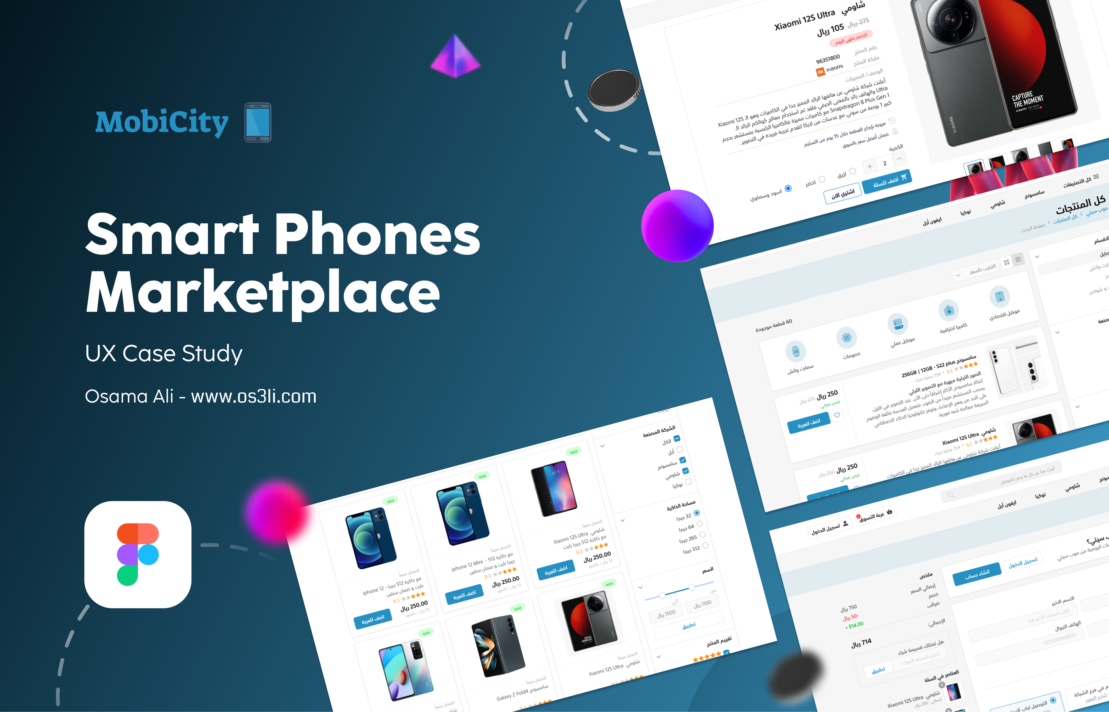
Smart Phones Marketplace
Understanding scope, challenge, and market opportunity — before a single pixel is designed.
From Goals Understanding to Project Implementation — starting with understanding project scope.
Users compare less than 2 products before purchase.
Users compare 3+ products with confidence signals.
Reduction in uncertain checkout exits.
Define business and user outcomes.
Apply mixed UX research and iterative design.
Design system, flows, wireframes, and UI pages.
Trust and clarity drive smartphone purchase decisions.
Prioritize transparent product info and scalable components.
MobiCity is a smart phones marketplace where people can browse, explore and purchase smartphone products directly on the web, mobile app, or social media commerce. Trust is the main currency of the future of e-commerce.
The number of social media users worldwide will reach 5.85 billion by 2027. The value of social commerce sales worldwide is estimated at $2.9 trillion by 2026.
Designing an e-commerce product easy to use for vendors and consumers where people can browse, explore and purchase directly without any blocks — merging social shopping at its core.
Executive Summary
Users need a reliable way to discover, compare, and buy smartphones across web and social channels without friction.
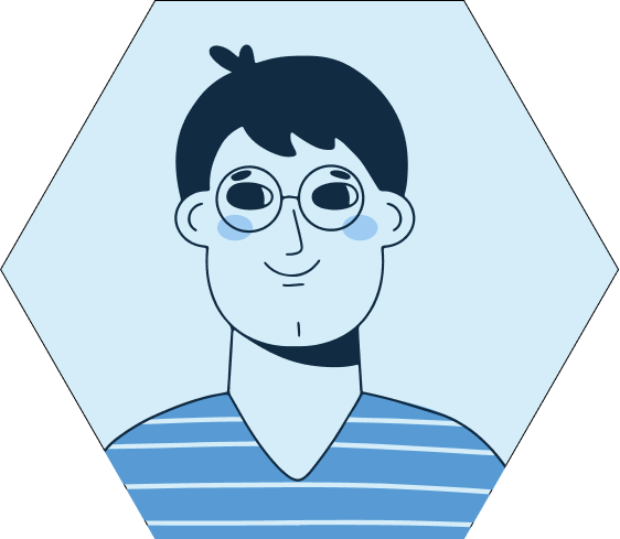
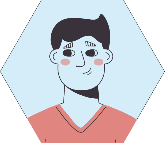
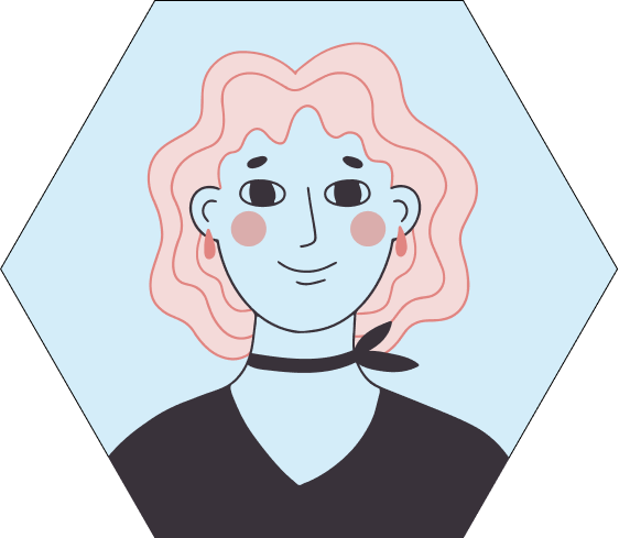
Researchers, value hunters, gift shoppers, brand devotees, social influencers, and repeat upgraders.
A trust-first e-commerce experience built with a modular design system and a full design thinking workflow.
Clearer product evaluation, stronger conversion intent, and better post-purchase confidence through guided UX flows.
Five iterative stages of Design Thinking — from empathizing with users to validating with testing.
I implement the Design Thinking Process — five iterative stages that shape every decision.
Interviews, survey, analytics, CRM, competitor scan.
Flow and interface iterations before final UI.
SUS target for usability confidence.
Research your users' needs — Interviews, Surveys, Data Analysis, Competitors, Customer Journey Maps.
State users' needs — Personas, Problem Statement, Empathy Maps, User Journeys, Task Analysis.
Challenge assumptions — Brainstorm Sessions, User Flow, Information Architecture, Mind Maps.
Create solutions — Wireframes, Interactive Prototypes, Mockups, Micro Interactions, Hi-Fi Design.
Validate with users — Usability Testing, A/B Testing, Heuristic Evaluation, SUS Surveys.
Flexibility — Design thinking is iterative and can skip steps based on current scenarios.
12 participants across 3 key segments.
Find, compare, buy, and submit review/referral.
Task success ≥ 85%, SUS ≥ 80, major errors ≤ 1 per flow.
By customizing our experience to align with user segments, we maximize reach, drive sales, and boost engagement.
Distinct groups with separate motivations.
Expected uplift in engagement per segment. (Design goal — not yet measured.)
Key journeys mapped to segment needs.
Spends time learning about products, comparing technologies, and reading reviews.
Interested in the best prices, deals, and discounts. Maximizes value for every spend.
Enthusiastic buyer purchasing products for their network of friends and family.
Loyal promoter of brands like Samsung and Apple — repeat buyers and brand ambassadors.
Always interested in new content, reviews, and offers. Drives social commerce growth.
Repeat customer passionate about staying up to date with the latest technology.
7 stages that define how customers interact with MobiCity from first touch to referral.
End-to-end from search to referral.
Highest risk points: evaluation and payment.
Increase review and referral completion.
First contact through search engines, email, or social. Visitors may arrive with a specific product in mind or to browse generally.
Curious / NeutralOccurs on product pages — customers first learn about items.
Interested / EngagedBoth on and off the site — customers compare prices, read reviews, and assess if the product fits their needs.
Anxious · Highest drop-off riskShipping details, secure payments, and confirmation that the purchase was successfully made.
Tense · Second highest drop-off riskKeeping customers updated on shipment status and providing ongoing customer support.
Expectant / PatientCustomer uses the product and may require support. Post-purchase engagement begins.
Satisfied · Support windowCustomers share a review and receive referral incentives like discount vouchers.
Delighted · Advocacy potentialNo search results found. Provide suggested brands and quick filters.
Use skeleton cards in PLP/PDP while pricing and stock are fetched.
Payment/API failure should show clear retry action and support route.
Design system, UI components, wireframes, and final screens — from atoms to full pages.
Goals were set based on research findings — shaping every visual decision from atoms to pages.
Greyscale, primary, semantic, typography.
Atoms, molecules, and organisms documented.
Shared patterns across pages and flows.
Hand-drawn wireframes gave the process its authentic touch — bridging research and high-fidelity design.
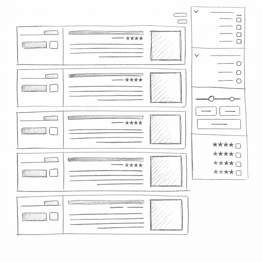

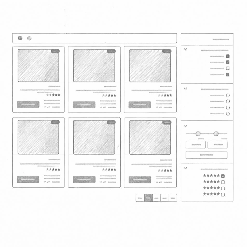
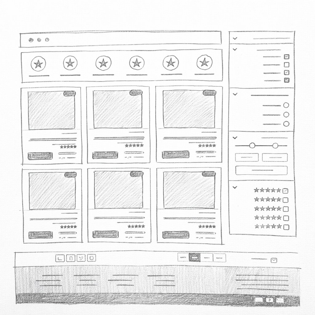

Low-fidelity exploration completed before locking the visual system and component architecture.
H1 Display
H2 Headline
H3 Title
H4 Subtitle
The quick brown fox jumps over the lazy dog.
LABEL TEXT
Use when: the action is direct, clear, and has a single priority.
Avoid when: multiple primary actions compete in the same viewport area.
Composition rule: one primary button plus one secondary button per action group.
منصة اكتشف موبايلك الجديد بأفضل الأسعار مع ضمان الجودة والشحن السريع.

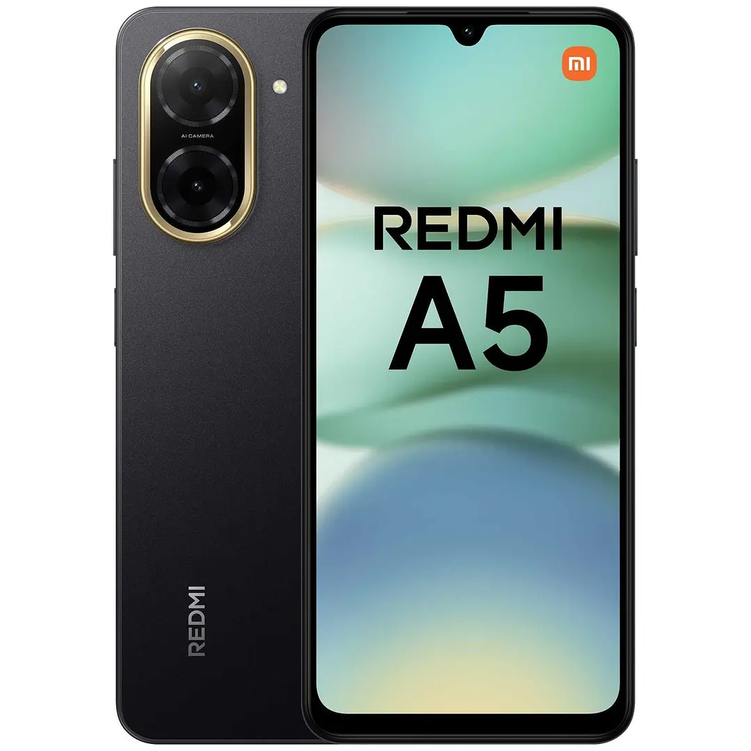
شاشة Dynamic AMOLED 2X ٦.٩ بوصة — كاميرا ٢٠٠MP — بطارية ٥٠٠٠mAh — شحن سريع ٤٥W
جرّب إزالة الفلاتر، أو مراجعة الكتابة، أو تصفح الاقتراحات بالأسفل.
Full pages assembled from the design system components — from Home to Checkout.

منصة اكتشف موبايلك الجديد بأفضل الأسعار مع ضمان الجودة والشحن السريع.
This preview demonstrates token and component consistency from hero to product grid.
Usability testing was conducted with 12 participants across 3 key segments. Here is what the validation revealed.
Target achieved — find, compare, and checkout flows completed without critical errors.
Usability confidence target set at SUS 80 across all key segments.
Design goal: reduce uncertain exits at payment step through simplified, transparent checkout.
Participants responded positively to trust signals (badges, warranty visibility, seller ratings). The comparison feature reduced evaluation anxiety for The Researcher and Value Hunter segments. The checkout simplification cut the number of form fields from 12 to 7, which participants described as “much faster than expected.”
MobiCity is a commissioned UX design project — the prototype was fully validated in usability testing and delivered as a Figma handoff with design system documentation. The platform was not shipped to production during the scope of this engagement.