9:41
Home
Adam Saad Junior Hero
Points Collected 120
Search
A mobile app helping Cairo teens discover and share safe, age-appropriate hangout spots — designed as part of the TFSS (Teen-Friendly Spaces Survey) Audit, a research initiative to understand and improve public spaces for young people.
Further, we also believe that being able to define teens safe and friendly spaces more clearly and putting a score based on this audit, will encourage people and authorities to work towards improvements And to encourage quick response.


I needed to design a mobile application to help understand teens' preferences — what activities and behaviors occurred in their favorite places.
The application would be downloadable by scanning a QR code, tracking the user's location and saving check-in data to the cloud.
The "Safety and Friendly Teen Spaces" (TFSS) audit is a tool to understand teens' preferences — their favorite places and reasons — and how teens perceive their environments, through the following objectives:
Audit Process: “ safety and friendly teens spaces ”


Focus groups started with a 5-minute introduction to understand pain points, mindset, tasks, and motivation.
Explore teens' experiences and define personas from behavior and needs.
Test prototype usability with the same groups through simple tasks to validate if they can discover suitable places by age in an easy way.
We focused on teens' real experiences in their environment.
Based on focus groups with 9 participants across two sessions, I defined a primary persona representing the core user type.
She is a high school student, looking for distinctive places to hang out with friends, does not like to hang out in the club or routine hangout, searches for special places through Instagram or friends' suggestions, and avoids traditional family hangouts.
She prefers places for adults, away from younger children, and with people closer to her way of thinking.


While Going Through The Research And Analysis Phase,
The Following Goals Were Set Based On My Findings.
System map of onboarding, branching auth options, core tasks, and account actions.

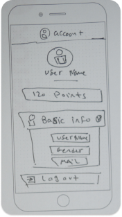
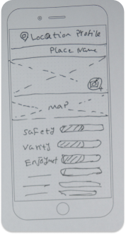
Original sketch sheets of the main features and interaction paths.
Design system snippets are kept in this same page for quick reference and handoff.
Montserrat
Aa Bb Cc
Regular 400 / Semibold 600 / Bold 700


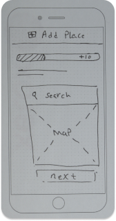
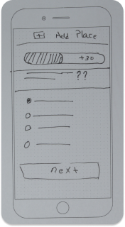
Sessions were run with screen sharing and task-based scenarios using interactive prototypes. Findings highlighted friction from too many questions while adding a new place.
8 / 9 participants completed core journey.
Too many questions in Add Place flow.
Question count reduced and completion improved.
Reduced question overload in Add Place flow, then validated again before developer handoff.
Usability testing with the original focus group participants validated the core flows and highlighted one key iteration.
8 of 9 participants completed the core journey end-to-end on the first attempt. The main friction point was the Add Place form — too many questions in a single screen.
89% task success rate
After reducing the Add Place questionnaire to a progressive-disclosure flow, re-test completion improved to 91%. Participants described the gamification mechanic (points for adding places) as the feature they were most excited to use.
91% after iteration
“I would actually use this — it’s exactly what I do on Instagram but safer and made for me.” — Participant, Phase Two focus group
This was a research and design project; the prototype was validated in usability testing and delivered as a Figma handoff. The app was not shipped to production.
Final package delivered with flows, components, states, and implementation notes for developers, including behavior logic for location, scoring, contribution, and moderation responses.


